One of the concerns I hear quite often about documentation is that people aren't reading it. This results in users continuing to ask managers and Admin the same questions, and doing processes incorrectly.
While you can do quite a bit to help users reference your documentation (here are a few ideas), making your documentation easier to consume will go a long way. So today, I'm going to share a tip that may help you in your quest for making documentation easier to understand - using a flowchart.

"I avoid flowcharts"
If you are like 95% of everybody out there, you probably avoid making and using flowcharts for one of these reasons:
- You are not good at making them
- You do not like making them
- You cannot remember what all of the symbols mean
- You cannot remember best practices and you might break a few rules
I don't blame you - creating a perfect flowchart is very difficult and is somewhat of an art. But your flowcharts don't have to be perfect to be helpful. A simple, visual representation of a process can help users get a sense of the big picture, and make the process seem less intimidating.
Keep it simple
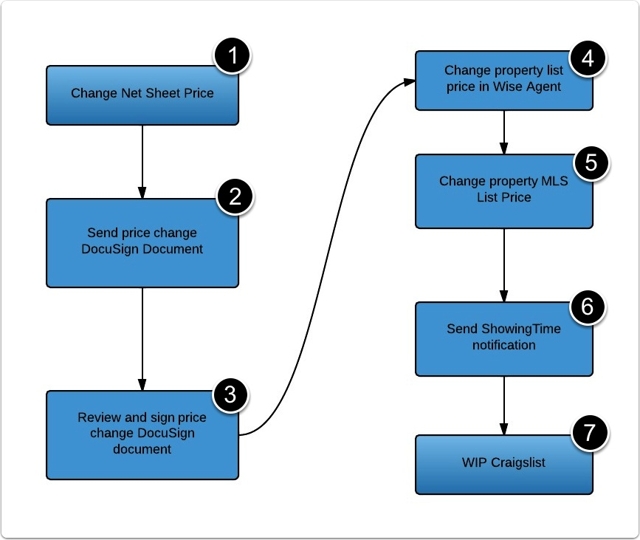
The graphic above is purposely done poorly. It doesn't follow all of the best practices nor does it include symbols of the databases that will be affected, decisions that will be made, or anything else that you might expect to see on a flow chart. But if all you know how to do is draw a few boxes with arrows, start there.
If you have a nice program like Lucidchart, Visio, or Excel, you can make beautiful flowcharts that are fairly complex. Here are some examples of flowcharts that have a bit more detail:


Your flowchart only needs to communicate, in a visual way, the basic flow of actions. If a few simple boxes and arrows can accomplish that, then keep it simple. If adding a few more symbols or including some lines of separation is necessary, then do it.
Just don't let the fear of imperfection stop you from trying.
For those using ScreenSteps
If you are using ScreenSteps, you can import a flowchart graphic into a ScreenSteps article or create a simple flowchart using our annotations (just take a screenshot of a blank document and add annotations over the top of it). You can then list the steps below the image and link each step to a separate article that has detailed information.
Add the sequence annotations to different parts of the flowchart and readers will be able to quickly identify where the instructions are located for any part of the process. Here's an example of a ScreenSteps article:
Changing the price for a residential listing
Overview of process with links to step-by-step guides
That graphic is not going to be winning any awards, but it communicates the process visually and is easy to identify where detailed instructions are located. Just click on a link and you will be able to quickly see how to accomplish each step of the process.
Here is that same article with a flowchart created using ScreenSteps. I just used annotations and included a few graphics with the "add image" feature:
How to Change the price for a residential listing
Overview of process with links to step-by-step guides
Again, I won't be impressing my college professor with this simple flowchart or my inclusion of logos - but I don't care about him. I care about whether readers can look at this article and understand the overall process and quickly find the how-to information they need.
You can see what this article looks like in a ScreenSteps article by clicking here.
Start simple
Our philosophy has been to start simple and continue to improve what works. Create a recipe article that has a basic flowchart at the top instead of a video. Then have your users reference it when they have a question about performing a process (during training or as a follow up email).
If you get a good reaction, then continue to create more recipe articles that include flowcharts. If you get a negative reaction, then make a few tweaks and try to improve how your documentation reads. Find out what works, and then continue to improve on it.
Note: The articles were donated to me by Satya Realty. They use Virtual Assistants from around the world to take care of the realty processes so the agents can spend more time with their clients and less time at the computer.


