

Are you making these common documentation mistakes?
When it comes to capturing your standard operating procedures (SOPs), you often have a lot of information you need to transfer from your experts to your employees. And you have to do it quickly.
As the content creator for your company's documented procedures, that can be challenging.
Working as the head consultant for ScreenSteps — a knowledge ops solution — I've coached hundreds of companies on how to write clearer digital guides for their end-users.
Here are 14 examples of common mistakes you might be making (and yes, I even included a mistake we made in our own documentation).
These are mistakes you'll want to avoid. Luckily, I also provide a link to download our free digital guide templates so you can start writing clearer digital guides today.
I should also note the companies featured below have good documentation (for the most part) — I just highlight a few changes that could make it great documentation.
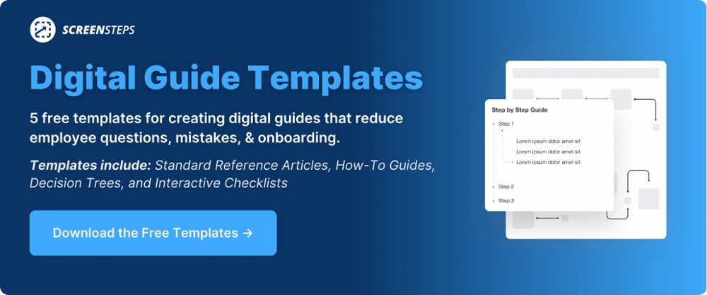
FREE DIGITAL GUIDE TEMPLATES
Need help documenting your procedures? Download our free digital guide templates. These templates will help you capture your standard operating procedures (SOPs) in the form of checklists, standard articles, decision trees, and more.
1. Having no documentation
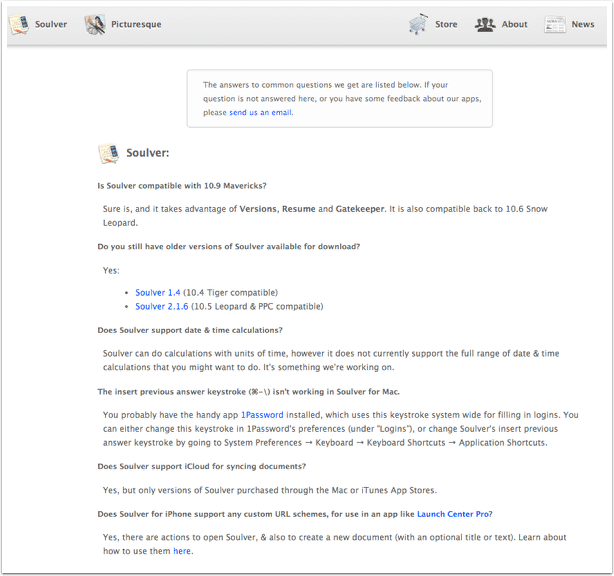
The first example is not having any documentation. I purchased this great software, and I like it very much, but I was surprised to find it does not actually have documentation — rather, it has a fairly simple FAQ. If I want answers, I have to send an email.
Even if the product is simple to use, I'm sure there are features, possible workflows, and time savers that I can't quickly learn about because there is no documentation to browse.
Providing little to no documentation, and then including an invitation to email you with questions invites an overwhelming amount of email. Don't do this.
2. Not including pictures
Here are a series of instructions that were written out. It probably would have been easier to just take a screenshot instead of typing out, "Click on the button at the bottom with the gear icon and the downwards-pointing arrow next to it, and select 'Apply to enclosed items...'"
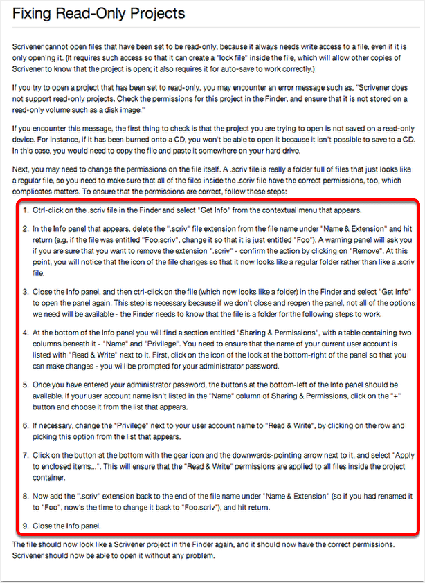
Following on-screen processes from a written description is not easy — so don't make your end-users do it.
3. Making it difficult to browse
Several help desk ticketing services provide an online knowledge base option, and for the most part they are pretty good. But if you have a lot of documentation, it becomes very difficult to browse the knowledge base.
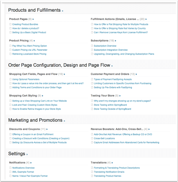
Making your documentation easy to browse might not seem like a big deal if your knowledge base has great search capabilities; however, your end-users like to see a menu of options they can choose from if they are unfamiliar with what's possible.

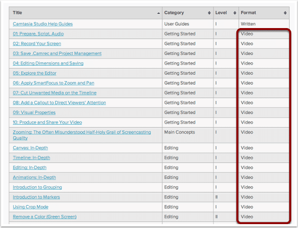
4. Writing unidentifiable titles
Article titles are supposed to make it easy to quickly scan a page and find what end-users want.
In this example below, it's difficult to scan the options because they all start with a common name that doesn't really mean anything — "Camtasia Studio."
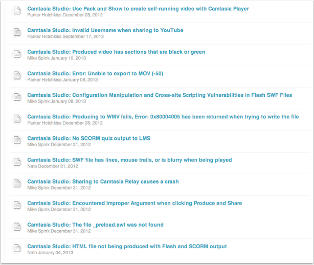
A better naming convention would be to ask a question that end-users ask, and title your article with that question (or use the name of a workflow). Whatever you decide, make sure it's specific and descriptive so end-users know the question that the article will be answering, and can find it easily while browsing your documentation.
🔎 Related: 10 Examples of Great End-User Documentation
5. Allowing communities to dictate guides
Communities have their place, and it's great to get the collective knowledge of everyday users — but they are also open to ranting.
When you use an intranet or a corporate wiki where the documentation is more collaborative, it is difficult to keep an up-to-date and accurate digital guide.
The back-and-forth discussions about who is right and who is wrong make it really difficult for end-users to find the answer they are looking for.
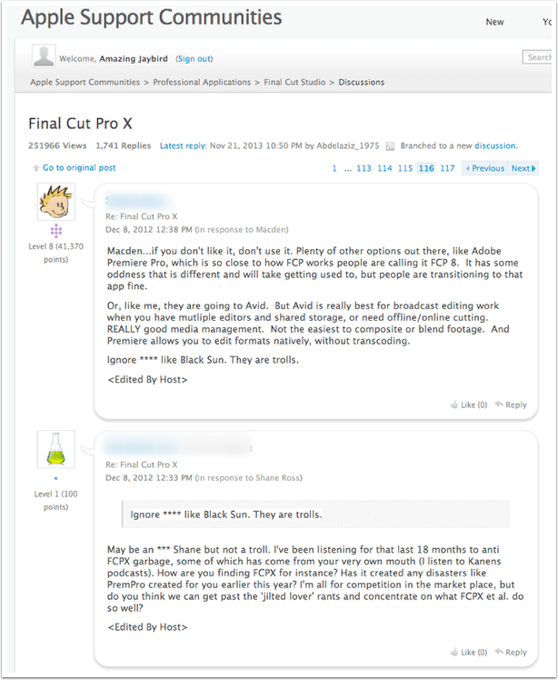
Take advantage of collective knowledge, but make sure to monitor responses and delete anything that takes away from the purpose of your knowledge base.
6. Making users download something
Requiring users to download a PDF slows down the knowledge transfer process. It adds an extra step before end-users can find an answer to their questions.
It's difficult for you to reuse a guide when you have to download it. Instead of sending somebody a link to the exact answer, you have to say, "Look on page 75 of the PDF manual."
Plus, if an end-user downloads a PDF and refers to it, they may not see any updates to your workflows or policies because they are referring to an outdated version. If everybody wants a PDF, then provide them with the option — but don't make it the only option.
7. Putting documents in an inconvenient location
Okay, so this isn't an example of bad documentation software, but it's still a great example. This is my apartment complex, and it has terrible documentation for visitors.
If you are visiting me, your GPS will take you to this entrance; however, you cannot actually get in from this entrance as a visitor. There is a sign that tells you this, but it's in a terrible location.

Almost every day I drive home, I see a perplexed visitor waiting for something to happen because they don't see the sign.
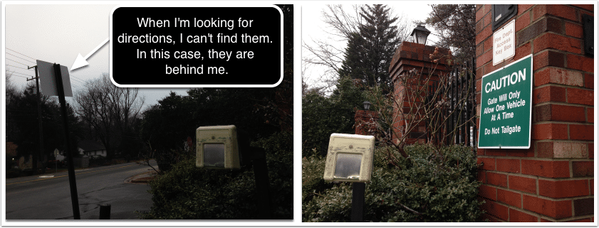
When somebody drives up to the gate, they are not looking for instructions until they get stuck. When they are stuck, the picture above is what they see — nothing about going around to another entrance.
The sign that tells them that important detail is behind them and out of view. I always have to roll down my window and explain how to enter the complex.
The same goes for your end-users — they aren't looking for instructions until they get stuck. If you make those instructions hard to find during their time of need, they will be perplexed and wait for somebody to tell them what to do. Put your documentation where your end-users need it.
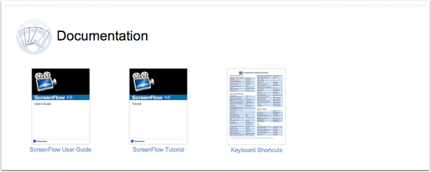
8. Only using video
Videos are nice for explaining something for the first time and providing an introduction, but end-users don't like referencing a video when they simply forget which button to push.
To the credit of the example above, they did provide some text documentation as well, but unfortunately, it was locked up as a PDF.
If you want to include video, a nice balance is to have a video up top that does a walkthrough, and then have step-by-step instructions below for quick referencing later on. The videos and instructions are all in one convenient location.
9. Including overview screenshots
Most people fail to produce great documentation because they think it's necessary to do overview screenshots of every possible window — but that's just overkill. Yes, these screenshots might be helpful 5% of the time, but your documentation does not need them.
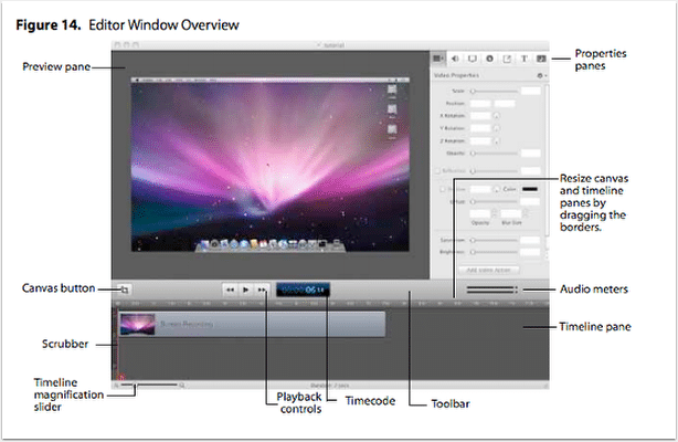
Remember, end-users aren't going to sit down with your documentation and read it like a novel. Documentation is referenced when people get stuck or have a question. Instead of doing overview explanations, just answer simple questions and document very specific workflows — that kind of documentation is the most helpful.
10. Listing all of the possible actions
Similar to #9 above, this suffers the same consequence — an image that looks more like an octopus than anything helpful.
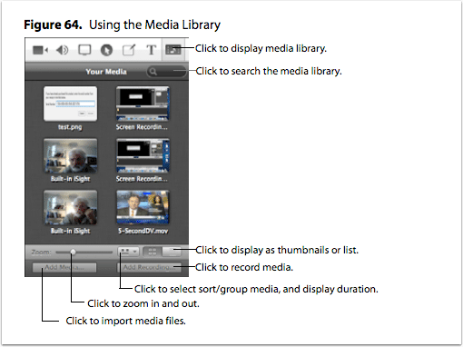
Again, this style of documentation assumes that end-users are reading everything you write. But that's not the case, they just want an answer to a specific question. So, one way to break this image up is to answer each individual question in a separate article:
- How do I display as a thumbnail?
- How do I display as a list?
- How can I zoom in and out?
- How can I import media files?
Unique articles that answer each of those questions will be much more helpful than screenshots saying, "Here's how you do everything!"
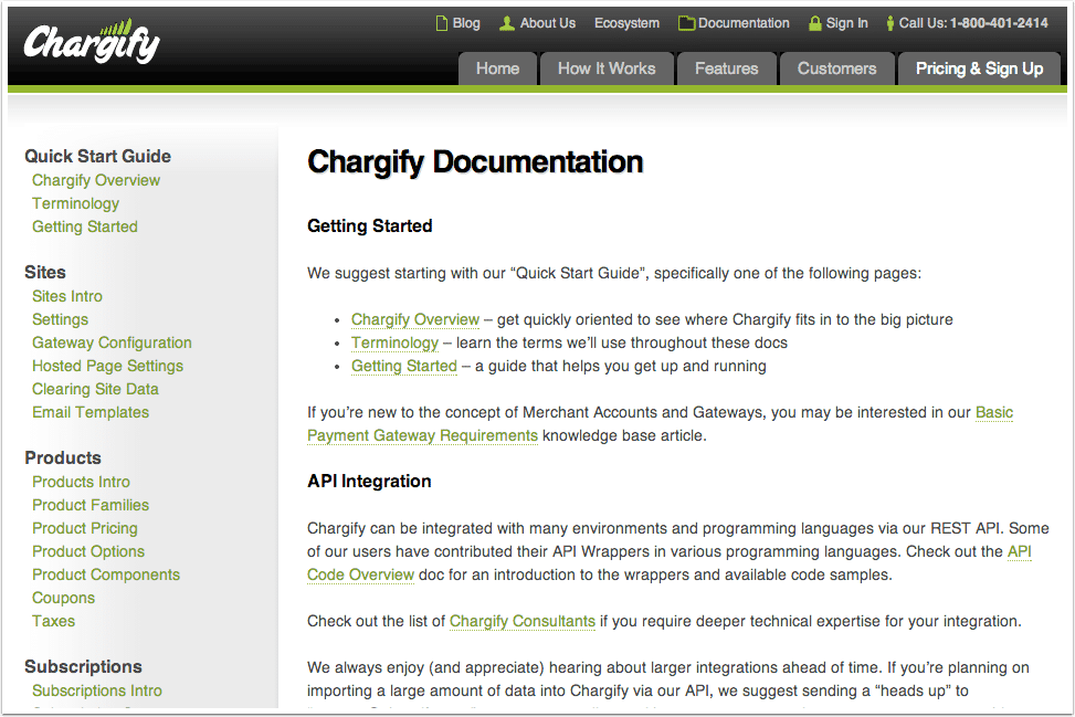
11. Not linking to a referenced process
In this article, it says to make sure I have created an export file and correctly prepared my data ... but then it leaves me hanging.
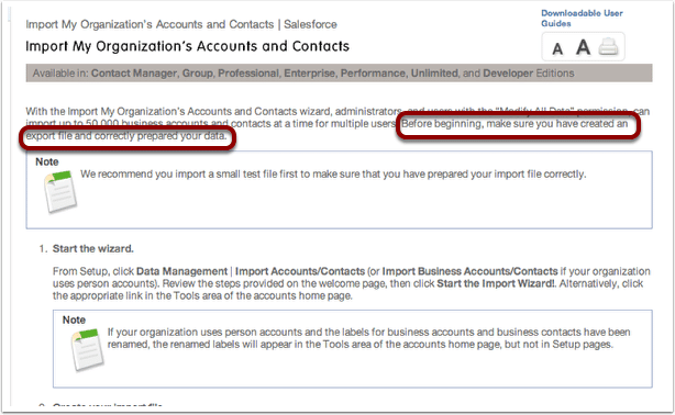
At the very bottom of the article there is a link under "See Also:" but readers (like myself) may not get to the bottom of the article to see the link — they will drop everything and do a search for creating an export file and preparing their data. Make life easier by including links to referenced processes.
12. Skipping a step (even a minor one)
When I first read the instructions below as a new Admin, it took me a while to find where Data Management was located.
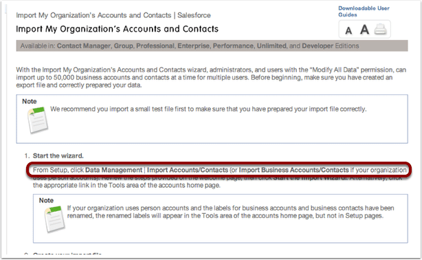
This could have been resolved by including "From Setup, under the Administrator section, click on Data Management | Import..." (the same result could be reached by just providing a screenshot).
Don't make your end-users hunt around their screen looking for what you are describing because you skipped a step. For new users, each step is important.
13. Letting documentation become outdated
This is actually an example from our knowledge base (gasp!). Last week, our developer added a button to the interface, but our documentation didn't show that (as of this screenshot).
Fortunately, for all of our users, I just went in and replaced the image with an accurate screenshot — crisis averted. But still, the crime of outdated documentation is serious. Outdated documentation is very frustrating to end-users.
14. Not including a search bar
When it comes to managing knowledge in your business, you need a software program that makes it easy for end-users to search your knowledge hub. That includes having a search bar.
It's frustrating for employees when they can't find the guide they need. Make it as easy as possible for your end-users to find an answer on their own. It will help them be more self-sufficient.
Create digital guides that are easy for end-users to follow and scan
Your process documentation is meant to help your end-users handle procedures on your own. If you are falling victim to any of these 14 mistakes, it is making it more difficult for your employees to work independently.
With a ScreenSteps knowledge ops platform and the Find & Follow Framework, we help you write findable, followable, and scannable digital guides.
The software puts the guides at your employees' fingertips for easy access. Then, when you follow the Find & Follow Framework, you write clear guides that help employees work confidently, efficiently, and independently.
Ready to create digital guides that are easy for your end-users to follow?
Download our free digital guide template packet. In it, you get five free templates, including standard articles, how-to guides, checklists, and decision trees.